Beyond the Flat Screen: The UI/UX Design Themes Dominating Modern Interfaces
The digital landscape is undergoing a massive visual shift. For years, minimalist flat design reigned supreme, prioritizing clean lines and fast load times. Today, designers are breaking away from those rigid constraints to create interfaces that feel tactile, immersive, and rich with personality.

Beyond the Flat Screen: The UI/UX Design Themes Dominating Modern Interfaces
The digital landscape is undergoing a massive visual shift. For years, minimalist flat design reigned supreme, prioritizing clean lines and fast load times. Today, designers are breaking away from those rigid constraints to create interfaces that feel tactile, immersive, and rich with personality.
Whether you are building a cutting-edge mobile app or a high-converting web platform, understanding modern design themes is essential to captivate users. Here is a deep dive into the top UI/UX design themes dominating the industry today.
1. Glassmorphism: The Sleek Illusion of Depth
Glassmorphism has cemented its place as a favorite for modern operating systems and web applications. It relies on a translucent, frosted glass effect that allows background elements to peek through subtly.
Key Features: Intense background blur, semi-transparent white borders, and vibrant, multi-colored backgrounds.
The Psychological Vibe: Premium, clean, and futuristic. It creates a clear visual hierarchy by physically making layers feel closer to the user.
Best Used For: UI overlays, modal pop-ups, dashboard sidebar menus, and music app interfaces.
2. Neumorphism: Soft, Tactile Realism
Often called "Soft UI," Neumorphism bridges the gap between old-school realism (skeuomorphism) and flat minimalism. Instead of stacking elements on top of a background, Neumorphic elements appear to grow directly out of the background.
Key Features: Monochromatic color palettes, precise inner and outer drop shadows, and low visual contrast.
The Psychological Vibe: Satisfyingly tactile, smooth, and physical—resembling molded plastic or soft clay.
Best Used For: Minimalist smart-home control panels, calculators, sliders, and audio equalizer dials.
3. Neubrutalism: Raw, Loud, and Unapologetic
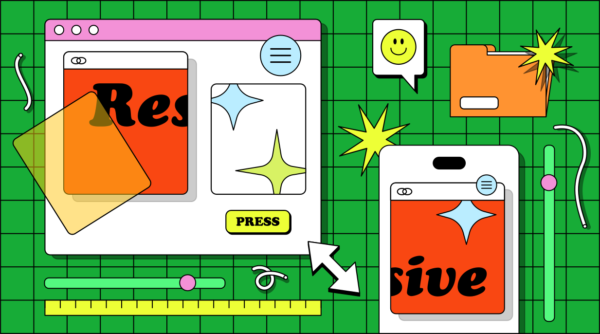
Neubrutalism is a direct rebellion against standard "safe" corporate design. Inspired by architectural brutalism and early internet aesthetics, this theme throws traditional design rules out the window in favor of high-energy, raw layouts.
Key Features: Harsh thick black strokes, 100% saturated primary colors, asymmetrical grids, and unpolished typography.
The Psychological Vibe: Edgy, playful, honest, and highly memorable.
Best Used For: Web3 platforms, creative portfolios, trendy e-commerce brands, and agency landing pages.
4. Bento Box Grid: Masterclass in Organization

Popularized by hardware giants and tech landing pages, the Bento Box layout arranges content into distinct, rounded containers. It mimics the compartmentalized look of a traditional Japanese bento lunch box.
Key Features: Varying card sizes, uniform gap spacing, rounded corners, and self-contained content within each cell.
The Psychological Vibe: Clean, structured, highly scannable, and efficient.
Best Used For: Product feature showcases, analytic dashboards, and digital resumes.
5. Retro-Futurism & Y2K Nostalgia

As Generation Z dominates consumer culture, early 2000s tech aesthetics have made a massive comeback. Retro-futurism blends the optimistic, tech-heavy vibes of the past with clean, modern performance.
Key Features: Metallic/chrome gradients, neon cyber accents, pixelated typography, and low-fidelity grid structures.
The Psychological Vibe: Nostalgic, energetic, and culturally relevant.
Best Used For: Gaming hubs, street fashion e-commerce, and community-driven social apps.
Choosing Your Next Interface Direction
Design themes are never one-size-fits-all. While Neumorphism looks incredibly sleek, its low contrast can create accessibility hurdles for vision-impaired users. Conversely, while Neubrutalism grabs immediate attention, it may overwhelm users trying to complete serious tasks like online banking.
The most successful modern interfaces rarely use just one theme. Instead, they mix elements—like using a Bento Box grid for content structure, and adding subtle Glassmorphism to the navigation bar—to build a balanced, beautiful digital experience.
Comments
Loading…